Tuesday, 10 December 2013
COMPLETE MAGAZINE
This is my complete double page spread. I had it reviewed and looked over by Zaf and he approved of my journalism!
Interview
These are my interview questions and answers for my cover star Faith Evans. I don't plan to use all of them but I will choose which questions are best for my double page spread
Tuesday, 3 December 2013
Quick Update
So far I have a basic outlook of all my pages. However I collected feedback and constructive critism in my media lesson which I plan to use to better my pages. They are all still somewhat incomplete I should be done in about 2 more lessons.
Saturday, 30 November 2013
Wednesday, 27 November 2013
Progress
More had been changed and added onto my contents page. With one more lesson I will have added pictures and completed it
Tuesday, 26 November 2013
Progress on contents page
This is my most update progress of my contents page. I haven't started adding pictures, but all is going well
Wednesday, 20 November 2013
Start on my contents page
I have started to make my contents page although I need more location photography all is still going well
Start on my contents page
I have started to make my contents page although I need more location photography all is still going well
Monday, 18 November 2013
My masthead
Today I started finalising on my masthead. However I haven't added colour,
I'm still unsure about whether I want to put colour in I might just add a coloured outline
I'm still unsure about whether I want to put colour in I might just add a coloured outline
Saturday, 16 November 2013
Tuesday, 12 November 2013
Template for my contents page
I have started to get together what my contents page will look like, this is a brief outlook of what it will look like
Thursday, 7 November 2013
Using illustrator
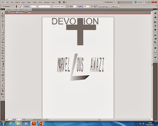
 This is my first attempt at using illustrator. I was able to manipulate and alter letters in the text to fit how I want to. I also was able to create a gradient look to the letters after manipulation
This was when I was using the manipulating tool to change the T to look like a cross because this is a creative touch that I added to make my masthead more attractive and fit to the target audience
This is another attempt of mine to manipulate, alter and add or change things. I was able to change my V to make it look longer on the right hand point of the V it worked and I have added this touch to my final masthead idea
Friday, 25 October 2013
Thursday, 24 October 2013
Monday, 21 October 2013
Wednesday, 9 October 2013
Tuesday, 1 October 2013
Template of my college magazine

This is a brief look of what my magazine should look like with some adjustment
Sunday, 29 September 2013
Wednesday, 25 September 2013
Thursday, 19 September 2013
Just A Small Update
In my media lesson I have started researching and looking at a variety of different magazines for inspiration and ideas on the content for my future magazine :)
Tuesday, 17 September 2013
Subscribe to:
Comments (Atom)


